Kontaktinformationen
274 Marconi Boulevard, Suite 400Columbus Ohio 43215
Vereinigte Staaten von Amerika
Social:
Informationen
Mitarbeiter: 30
Mitarbeiter: 30
BillboardsIn.com
274 Marconi Boulevard, Suite 400Columbus Ohio 43215
Vereinigte Staaten von Amerika
What Not To Do When Designing Billboards
Today, we’re going to be taking a look at how not to design a billboard.
At BillboardsIn, we give our clients the power to submit their own billboard designs. Designing your own billboard can be rewarding, but there are some design tenets that are important to know.
Avoid Clutter
When designing a billboard, your first instinct may be to fill it with as much information as possible so that passersby are able to know everything about your business, product, etc. However, this isn’t a good way of thinking because it can lead to lots of clutter on your billboard.
If people see a billboard that’s filled with words and/or lots of images, they will give up trying to read it, and you have lost out on a potential customer.
When designing a billboard, the main challenge comes from conveying the message efficiently. On average, people only have about six seconds to look at a billboard, so it’s best to use about eight words maximum, with one central image, and contact information. This will help to ensure that viewers can consume all relevant information.
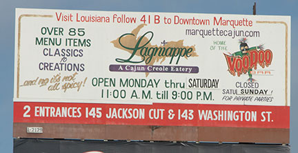 This is an example of how easily a billboard can get cluttered. It is likely that viewers may not even bother reading it. Photo via Michigan State University.
Bad Fonts
Choosing an easily readable font is paramount to any billboard design. It’s best to avoid cursive or other handwritten fonts because these can be hard to read quickly. Large, bold sans-serif fonts are the best way to go.
Remember, billboards are often viewed by drivers. When someone is going more than 40 mph on a road, they’re not going to be able to read and digest information that is displayed in fancy or calligraphic fonts.
If you are adamant about using a nice cursive font, then limit it to a few words. For instance, let’s say that the name of someone’s fashion boutique is written in a fancy, cursive font. Putting that on a billboard may be okay because it’s limited to the company’s name; any more than that would not be appropriate.
Consider the Angle
The actual placement of your billboard is just as important as the design. Consider how the layout will look from a certain angle. Also, it’s not a bad idea to be familiar with the area and specific billboard that the design will be posted on. Although multiple campaigns may overlap with your own (meaning, what starts as the ad next to your reserved billboard may not be what is there for your entire campaign), it never hearts to drive by and check it out!
These things should be taken into account because the example below could happen to anyone. It’s rather hilarious how such a failure could happen, but the people who bought the ad space were probably very angry.
 What are the chances? Be mindful of where your billboard design will be posted. Photo via Kulture Konnect.
File Management
When building a design in Photoshop or other design software, make sure that you’re keeping the project file organized. Every single art asset that is being used in the image should be properly named, and all elements should be the proper resolution. In the event that you have to give the project file to a graphic designer for edits, this will ensure they have an easy time locating exactly what they need.
In addition, make sure that the billboard design is being built within the proper parameters. At BillboardsIn, we provide a wide variety of billboard sizes and even give clients access to templates that they can build upon. Make sure to take advantage of this. If a billboard is created with the wrong measurements, you may have to adjust the creative after submitting it, which may affect your campaign timeline.
Colors and Contrast
The colors on your billboard are incredibly important. While it’s not necessary to have an extensive knowledge of color theory, you should understand what good and bad color pairings look like. Take a look at the chart below for a reference guide.
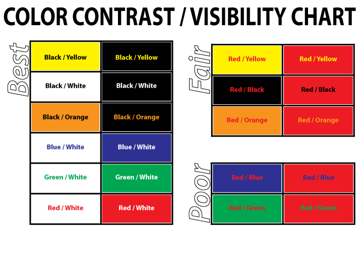 This chart does a great job of showcasing good and bad color pairs. Photo via Design Hill.
A great trick for testing color pairings is to print off a black and white copy of the design. If there’s a clear separation between the colors in black and white, then that’s a good indication that they’re a good pair.
With these factors in mind, you should now know what not to do when designing your billboard.
Keep up to date with our blog for more advice on creating the ideal billboard and more!